
3 Pillars of writing HTML & CSS
Responsive Design, Maintainable & Scalable Code, Web Performance
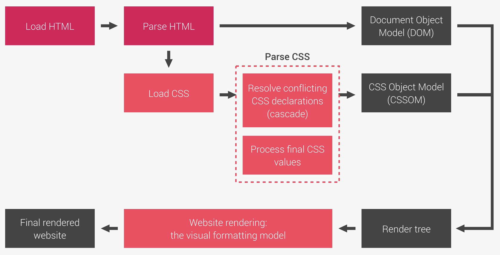
Reset CSS
*,
a::before,
a::after {
 margin: 0;
 padding: 0;
 box-sizing: inherit;
}

body {
 box-sizing: border-box; // padding are not added to width of box, width size is set at border level
}
Font Sizing, REMs and Responsive text sizing
Bad practice to declare font-size as pixels (prevents users from changing font-size in their browsers). Declaring font-size in REM sizes font to a multiple of the root font size (set by the browser, usually 16px).
If you wish to change the root font size, do so under the html element and as a percentage of the browser root:
html {
 font-size: 87.5%; // 14px if browser root is 16px
}
You can then use media queries to resize all fonts proportionately by changing the size declared in html.
Not supported in IE9.
Scaling divs in relation to Viewport Height:
Use [int]vh; (Integer is percentage of viewport height.
header : 95vh // Header is 95% of height of viewport
Clearfix
<nav class="clearfix">

.clearfix::after {
 content: "";
 clear: both;
 display: table;
}
Gradient
background-image: linear-gradient(to right bottom, rgba1, rgba2), url(../img/hero.jpg);
The above CSS puts an opaque gradient from top left to right bottom over a hero image.
Clip-Path / Polygon
clip-path: polygon(x y, x y, x y, x y, x y)
Creates a clipping mask over the element. Use polygon to create a shape. Parameters are Top-right, top-left, bottom-left, bottom-right.
Use Clippy to generate polygon
Translate (transform)
Reposition the elements top/left co-ordinates. Useful when using absolute position to centre an element:
.element {
position: absolute;
top: 40%;
left: 50%;
transform: translate(-50%, -50%);
}
g